Applying Design Thinking Process in Tool Development
Applying Design Thinking Process in Tool Development
by Irene Zhu
original pdf can be found here
What is the design thinking process? It was created by Nelson Norman Group, which is a UX consultancy started by the two founding fathers of UX discipline - Jacob Nelson and Don Norman.
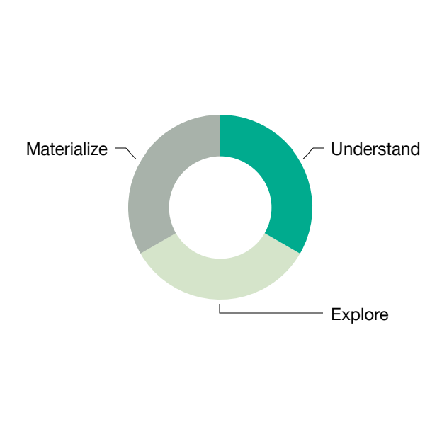
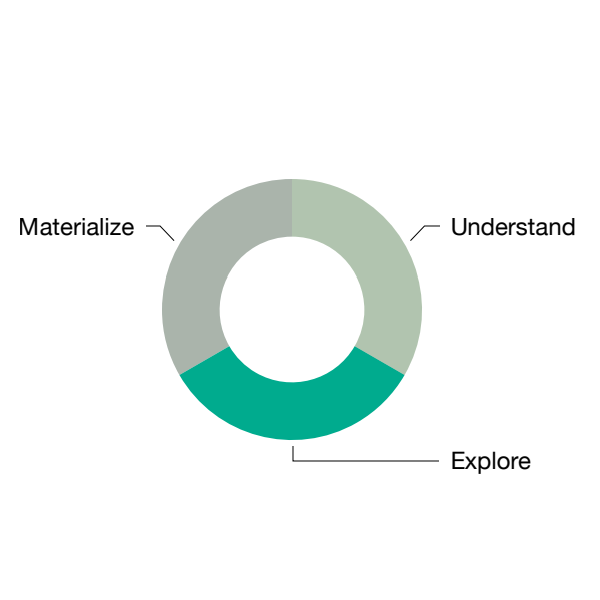
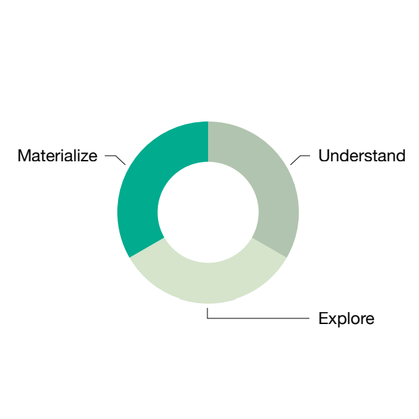
In this process, there are 3 phases, including “Understand”, “Explore” and “Materialize”.
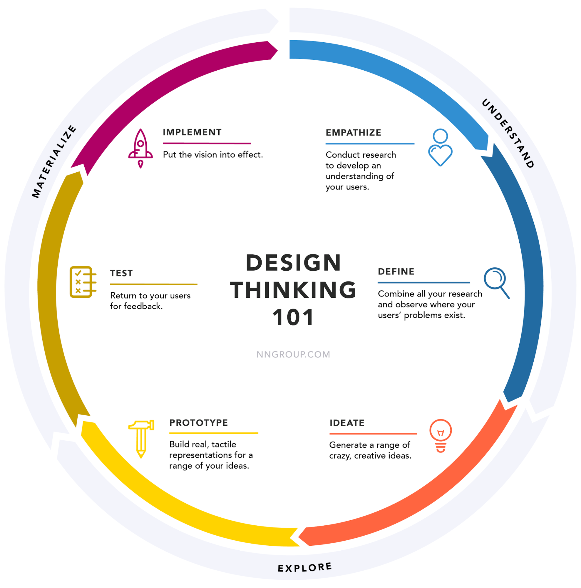
In “Understand” phase, we conduct research to develop an understanding of our users, then combine the data we get and summarize where our users’ problems exist. In “Explore” phase, we start brainstorming different design solutions that might solve the problem, and make those solutions into prototypes. In “Materialize” phase, we use the prototype we made to test out the design hypothesis. If there is any gap between what users expect to see vs what our design looks like, we try to close that gap as much as we could before moving into implementation.
You might want to ask, why do we care about this? Well, first off, a lot of tools and workflows in game development are very complicated. And design has long been an afterthought for us, applied only to touch up some aesthetics after the majority of the work is already there. But as our games get more interactive and immersive, the features required for tools can only get more complex.
Without the designing and planning up front, it’s easy for us to focus on fixing the immediate problem with solutions that don’t scale.
And without a thorough understanding of our users’ needs, we also tend to overcomplicate. Overtime our users find the tools harder to use, harder to learn. The training cycle gets longer. And it starts to interrupt their creative flows. What’s worse is that, after the engineers worked so hard on a feature, when it’s delivered, not a lot of people like it/or even know about it. And those are the situations we are trying to avoid.
But let’s pause for a sec and think about… what was the last time you’ve used something that you really enjoyed? Whether it’s a new iPhone, a smart home system, a Tesla, or even your fridge. It could be anything. And now imagine if we bring that kind of joy into our tools, what difference could it make on our productivity and creativity?
That’s why we’re looking at this process that’s widely adopted in the consumer product world, and trying to integrate it into our tool development. The goal here is to deliver experiences that meet our users need, are intuitive and scalable, and even bring joy.
But how exactly?
Below is a list of methods I’ve used for a variety tools I support at 343, organized based on the design thinking process. I won’t go into details about the tools for confidentiality reason, but will focus on the methods themselves and talk through how effective it was in my experience. Each method is rated based on how well it has worked for our team from 3 perspectives: Ease of use (how easy was it to use the method); time needed(how much time was needed to do it); impact(how much impact it delivered), on a scale of 1-5. The table below explains what the rating means for each category.
|
|
1 |
2 |
3 |
4 |
5 |
|
Ease of Use |
Very easy |
Easy |
Neutral |
Hard |
Very hard |
|
Time Needed |
Very fast |
Fast |
Neutral |
Time-consuming |
Very time-consuming |
|
Impact |
Very small impact |
Small impact |
Neutral |
Big impact |
Very big impact |
“Understand” phase
In “Understand” phase, we tried methods including persona, 1:1 interview, and journey map.
Persona
A while back we developed personas for different animation disciplines(gameplay and narrative). Below is an example of persona if you are not familiar with it.
Just like why other products use personas, we wanted to be able to understand our uses better: what they like, what motivates them, what they don’t like, what frustrates them. But since it’s for internal tools and we have a fairly small group, we also found persona pretty helpful as a communication tool. Because by talking about it often, it has helped increase the understanding and empathy between gameplay and narrative animators. This exercise has created a really good baseline understanding for many animation tools.
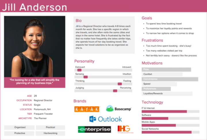
Two section I like to refer to the most in personas, are “motivations” and “frustrations”. They make the perfect starting points when brainstorming things we can do to make the workflow better. What does the user hate? Let’s reduce some of that. What motivates the users? Let’s give them more.
|
Ease of use |
3 |
|
Time needed |
4 |
|
Impact |
4 |
|
Potential challenges |
In order for personas to be useful, the implementation team would need to refer back to the data in personas often and use it as a guideline for a series of tools. The impact shows slowly and through other projects. It would also need to be updated on a regular basis, which I find is challenging, especially for a small team. |
1:1 Interview
Another thing I personally like to do is 1:1 interviews. 30 mins with about 5 participants are more than enough. If you are wondering why 5? Here is an article about why you only need to test with 5 users. I prefer to have the interviews semi-structured, meaning there are usually a few specific questions that I want to get answers for. But mostly the conversations are around more generic feature areas, so there is room for new topics/issues to surface. For example, If you want to know if the new feature A has worked for users, that could be your 1 specific question. Following that, you could ask what worked well in general, what didn’t work that well. If there is enough time, you could go through the tool section by section(or page by page) to let the participant talk about what the experience was like using each part of the tool.
One thing to remember is to always ask questions consistently, meaning if you have asked a participant how he/she likes the new feature A, you will need to ask every participant the same question. This way your data report could have summary like “3 out of 5 participants like this feature”.
|
Ease of use |
3 |
|
Time needed |
3 |
|
Impact |
4 |
|
Potential challenges |
The “Asking questions” part is not difficult as long as the interviewer has a fairly good understanding of the tool. The real challenge comes from synthesizing the data. One trick that I found helpful is to think about what kind of final report you want to have, then work backwards and look through the data. This would also require your data to be as consistent as possible. |
Journey Map
As a UX designer, I get asked a lot of questions like “can you map the workflow end to end?”. Naturally I ask around to see if people would have this information at hand already. But a lot of times, the team that work on one part of the workflow don’t know about the previous step/tool at all. That’s where a good journey map comes in. We did journey mapping for mocap pipeline recently, which was very helpful for the team to understand the big picture. But in this context, let’s take a look at a generic journey map as an example.
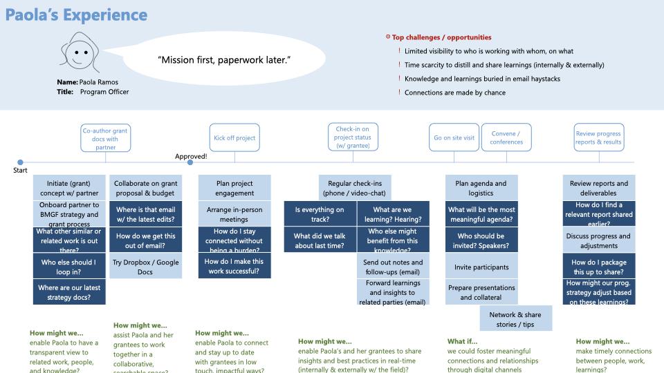
Here is an example of a journey map I made many years ago. Up top there is a quick preview of the person’s role and goal. In the timeline, from left to right, there are a series of activities she needs to orchestrate as a program officer. For each step, the light blue color represents “tasks”, the dark blue color indicates “questions”.
There’s a lot of information here. But it doesn’t have to be this way. The bare bone of a journey map is really just the timeline. It’s critical to map out what happens first, what comes after, especially when many on the team are often so focused on their own parts. In the tool development setting, we could use this format to map out each step for an environment artist for example: what are the tasks for users, where do they go for each step, is it an automated step or do we have a tool for it, can they finish the whole workflow independently or do they need information from someone else, is it possible to capture the information they need in a tool somewhere.
Journey map helps us see the big picture before going in depth on each step. It also helps us be aware of other factors(other than the UI) that might affect the user experience of a workflow, and provides an opportunity to identify if there are additional scope we would like to add up front. For example, if there are manual steps somewhere along the way that we would like to automate, this is a good time to evaluate if those scenarios could fit into a tool we already have or do we need a new tool for it.
|
Ease of use |
3 |
|
Time needed |
2 |
|
Impact |
3 |
|
Potential challenges |
The only challenge here for me was about finding the right people to ask questions, and digging up enough information to make the 1st draft of the timeline. |
“Explore” phase
Ideate and prototype are the common methods we use in “Explore” phase.
IDEATE
In a creative environment such as game studios, this is what I find the least challenging. I lost count on how many times I walked into a meeting room amazed by the sketches/ideas on the whiteboard. The only thing I want to say here is to make sure to anchor any design solution to the information we’ve learned in phase 1. Meaning each design solution should at least address a pain point that we’ve heard from our users, or add more of something our users really like. This way we don’t get too carried away by an exciting idea that might not meet any user needs.
|
Ease of use |
5 |
|
Time needed |
2 |
|
Impact |
2 |
|
Potential challenges |
Remember to anchor design ideas to pain points or motivations. |
Prototype
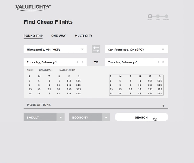
There can be many types of prototypes. No matter your prototype is interactive, or drawn on paper, as long as it helps users communicate your design intention, it gets the job done.
Here is an example of interactive prototype I found online. It’s very close to the ones I make at this phase of the project in terms of visual fidelity. I won’t get into details about how to make a prototype here, because it can easily be its own article. In general, any tool you use to make the UI today, you could start drawing simple elements and making screenshots of them. That would be the prototype. Then you could get feedback from users by showing the screenshots, before starting on the rest of development work.
|
Ease of use |
3 |
|
Time needed |
4 |
|
Impact |
5 |
|
Potential challenges |
As soon as you have your key use cases build in, start showing people and get feedback. It doesn’t need to be fully functional or pretty. |
“Materialize” Phase
There are 2 sub phases in “Materialize”, which are “Test” and “Implementation”. Note the “Test” phase here is to test out the idea before it gets turned into real software, not the QA testing that we’re most familiar with. The UX methods used in this phase are mainly around “testing the idea”.
Test - Design Review
With a prototype, we can start gathering feedback in our test phase. One way of gathering feedback is to do a design review, where a person presents the interaction flows to a group of users/stakeholders, and discuss what they liked/didn’t like about the design. In this phase, it’s helpful to invite user representatives from different disciplines, so that the feedback is not biased toward one small group of users.
To prepare for a design review, I might note down what interactions/user flows I want to demonstrate. For example, how to load a character in Maya, how to add animation data onto that character etc. It is also a good place for us to talk about things like: now that we can see the feature on the screen, is it worth doing cuz it seems expensive; are we really gonna be okay with the potential tradeoff?
The feedback I get the most can generally be grouped into 3 sections. There is the type of comments about spotting opportunities to reuse components and manage all our tools in a more modular way. Another type of comments that come up a lot is about weighing the benefit vs tradeoff of having some feature. The last type of comments, which is usually what we get the most, is the type that help us realized the gaps between what users are expecting vs what the design is delivering, which is core of this TEST phase here. It’s also the reason why we usually do more than 1 round of design review. Because by doing this kind of iterations, we can narrow this expectation gap quickly by adjusting the design prototypes.
If you are curious how many rounds of design reviews you should do, the answer is I’m not sure. I usually to 3-4 rounds, but it can vary from project to project. In each review, it’s helpful to show the design updates responding to the comments from the previous review. This way people can see the feedback they’ve given being reflected in the design, which is encouraging for them to contribute more. If there are less and less feedback coming up in each meeting (but people’s engagement level is still high). Congratulations! You’ve just successfully narrowed the expectation gap.
|
Ease of use |
2 |
|
Time needed (per iteration) |
3 |
|
Impact |
5 |
|
Potential challenges |
It can be challenging for some to get feedback that some users don’t like the design, especially in a group setting. When it happens, try not to immediately explain why you did what you did. Instead, let the users elaborate more about why he/she doesn’t like it. Remember it’s never personal. It’s all for narrowing the expectation gap. |
Test - Usability Testing
We could also do usability testing with the prototype at hand. Usability testing refers to evaluating a product or service by testing it with representative users. Typically, during a test, participants will try to complete typical tasks while observers watch, listen and takes notes. The goal is to identify any usability problems, collect qualitative and quantitative data and determine the participant's satisfaction with the product. Here is more info about what you need to prepare for a usability testing. Again, 5 participants are more than enough to discover usability issues. And we don’t need a fancy one-way mirrored lab to do it. A computer and a meeting room will do. In general, I do less usability testing comparing to design review for feedback gathering, simply because design review is faster to iterate on. But with usability testing, in the end you will have a more thorough and formal looking report, which makes it a nice option if we are kicking off a new version or closing down design changes for current version.
|
Ease of use |
2 |
|
Time needed (per iteration) |
4 |
|
Impact |
5 |
|
Potential challenges |
Running a usability test is definitely the most challenging one among all the methods discussed here. The link I shared earlier is a good starting point to learn how to do it. The main challenges for me when I first started doing it include: remembering the steps and when to present what to the participants; avoid asking leading questions and give the time to participants to explain what they like/dislike and why; asking questions consistently across different sessions. |
Implementation
One note here at the implementation phase is to make sure your design is well documented before implementation begins. Once implementation started, be prepared to update the design document throughout the entire implementation phase. Because during implantation phase, we often discover use cases we didn’t think about, or edge cases we didn’t make a design for, or engineers would like to discuss if it’s possible to use a different component because the one in design is hard to implement. All valid reasons. That’s why when the design document is first created, it makes a great reference but it’s not done. Over time we will add more details to it, tweak features, and group new use cases into future versions.
Summary
To summarize, we’ve talked about the three phases of design thinking process: Understand, Explore and Materialize.
In Understand phase, 1:1 interview are the most frequently used in my case, while persona could be a bit time consuming but delivers great long-term impact. Journey map is my go-to method to understand the big picture when users need to hop from one tool to another during their workflow.
In Explore phase, feel free to use whatever tool/medium to explore ideas and create your prototype.
Materialize phase is when we test out if the idea has met users expectation. We can test it with the prototypes made in the previous phase. If there is any gap between the prototype and users’ expectation, tweak, iterate, test, repeat until the gap is narrowed to an acceptable level.
Lessons Learned
- Always ideate with goals. I can’t stress this enough. One of my friends likes to say “brainstorming without an agenda is brain killing” which I love. Always make sure we make the most of what we learned in the “Understand” phase. It’s gonna save us a lot of time.
- And another thing is to share an action plan after each round feedback gathering. For example for scene assembler, the interview findings report was sent out to all animators with clear next steps. This is especially helpful when we have a small user group, because we want to avoid the “survey fatigue” as much as possible. If you are not familiar with the term, it’s to describe the situation that people are getting tired of filling out surveys because they feel their response didn’t go anywhere. Since we have a relatively small user group here, we can’t really afford losing anybody’s feedback like this. So it’s helpful to remind ourselves to keep our users in the know as much as possible and always make sure they know what difference their feedback has made, especially in the context of developing internal tools
- The third and forth one kinda go together, which is to say we don’t need to get everything absolutely perfect in this one round. But we do need to have very clear definition of done. So we could almost always iterate on a previous version and have a constant stream of feedback, and minimize the cost of not getting something right at the first try.
- The last thing I want to share here is that UX process isn’t some silver bullet that’s going to solve problems overnight. For internal tools especially, it also comes down to building trust with engineers and users, and start integrating parts of it little by little. With the design thinking process, slowly but surely it will make a difference in experience of using our tools.
Too often in game tools world we run into solutions which might have been intended as a short term solution years ago, but ended up being used till this day, because there are so many great things to work on and the resource is so limited. Those situations aren’t going to change overnight. But luckily we’re more aware of it and started to make changes incrementally. For internal tools, it also comes down to building trust with engineers and users. With the design thinking process, slowly but surely it will make a difference in experience of using our tools.